[ Context ]
Special edition of the iconic delivery packaging
[ Roles ]
Graphic Design: Myself
Concept: Hannah Holtrop
Copy: Alex Krancher
Strategy: Elly Doek
Creative Direction: Jesse Donker
[ Assignment ]
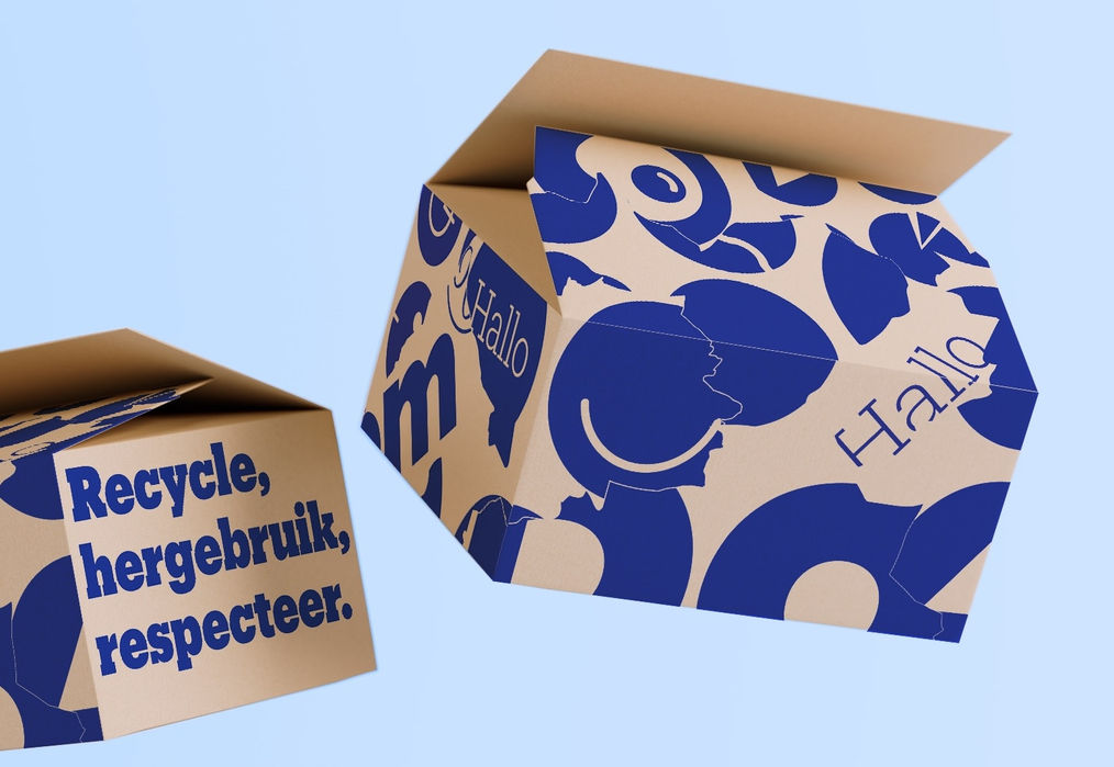
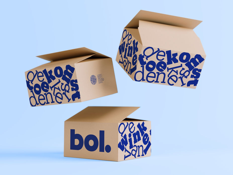
Recognized as one of bol's most powerful brand assets, the shipping boxes blend the distinctive pattern, blue color, logo and signature font to create instant recognition. For this project, I was tasked with redesigning our most used packagings (43% of shipments), to reshape the narrative in a new iconic way.
The goal was to enhance customer perception of bol as a socially responsible company. Ensuring the new design remains iconic, and aligned with bol’s new identity.
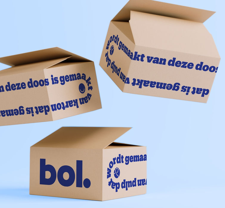
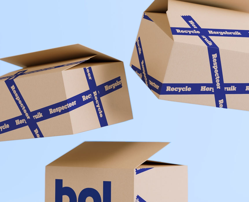
We introduced a minimalist version of our regular packaging, using less ink and highlighting recycling by giving the box a voice, making the message of sustainability more engaging.


BOL - SPECIAL PACKAGING
EXPLORATIONS


